
【React / Next.js】createPortalでmodalコンポーネントを作る
やりたいこと
モーダルは画面最前面に表示させることの多い性質上、bodyタグ直下にレンダリングしたいことがよくある。
そこで親コンポーネントより外にDOMをレンダリングできるReact Portalを使い、モーダルコンポーネントを実装してみる。
実装方法
1. モーダルの雛形を作る
import { type ReactNode } from "react";
const Modal = ({ children }: { children: ReactNode }) => {  return (    <div>      <div>        <button type="button" aria-label="モーダルを閉じる">          ×        </button>        {children}      </div>    </div>  );};
export default Modal;まずはpropsで渡されたchildrenと、閉じるボタンを描画する簡素なコンポーネントを作る。
import { type ReactNode } from "react";import { type ReactNode, useState } from "react";
const Modal = ({  children,  buttonText,  canCloseByClickingBackground = true,}: {  children: ReactNode;  buttonText: string;  canCloseByClickingBackground?: boolean;}) => {  const [isOpened, setIsOpened] = useState(false);
  const open = () => setIsOpened(true);  const close = () => setIsOpened(false);
  if (!isOpened) {    return (      <button type="button" onClick={open}>        {buttonText}      </button>    );  }
  return (    <div>      <div>        <button          type="button"          aria-label="モーダルを閉じる"          onClick={close}        >          ×        </button>        {children}      </div>      {canCloseByClickingBackground && <div onClick={close} />}    </div>  );};
export default Modal;- ボタンをクリックするとモーダルが開く
- モーダル内のxボタンをクリックするとモーダルが閉じる
上記要件を満たすように追記。
canCloseByClickingBackgroundがtrueの時は、背景をクリックしてもモーダルが閉じるようにする。
2. createPortalでレンダリング
import { type ReactNode, useState } from "react";import { createPortal } from "react-dom";return (const elmModal = ( <div> <div> <button type="button" aria-label="モーダルを閉じる" onClick={close} > × </button> {children} </div> {canCloseByClickingBackground && <div onClick={close} />} </div>);
return createPortal(elmModal, document.body);};
export default Modal;createPortalを使い、bodyタグ直下にモーダルをレンダリングさせる。
第1引数にはレンダリングしたい要素を、第2引数にはレンダリング先のノードを指定。
3. スタイルの設定
.wrapper {  position: fixed;  top: 0;  left: 0;  z-index: 2;  display: flex;  align-items: center;  justify-content: center;  width: 100%;  height: 100%;  contain: content;}
.content {  position: relative;  z-index: 1;  box-sizing: border-box;  width: 70vw;  max-width: 700px;  max-height: 90vh;  padding: 40px;  overflow-y: auto;  background-color: #fff;  border-radius: 5px;  animation: anim-modal 0.5s ease;  will-change: transform, opacity;}
@keyframes anim-modal {  from {    opacity: 0;    transform: translateY(15px);  }}
.btnClose {  position: absolute;  top: 5px;  right: 10px;  padding: 0;  font-size: 2.7rem;  font-weight: bold;  line-height: 1;  color: #bbb;  cursor: pointer;  background-color: transparent;  border: none;}
.background {  position: absolute;  top: 0;  left: 0;  width: 100%;  height: 100%;  background-color: rgba(0 0 0 / 50%);}
@media screen and (max-width: 768px) { .content { width: 96vw; padding: 30px 25px; }}あとはモーダルっぽいUIにしたいので、modal.module.cssを作成。
import { type ReactNode, useState } from "react";import { createPortal } from "react-dom";import styles from "../styles/modal.module.css";const elmModal = ( <div> <div className={styles.wrapper}> <div> <div className={styles.content}> <button className={styles.btnClose} type="button" aria-label="モーダルを閉じる" onClick={close} > × </button> {children} </div> {canCloseByClickingBackground && <div onClick={close} />} {canCloseByClickingBackground && ( <div className={styles.background} onClick={close} /> )} </div> );
return createPortal(elmModal, document.body);};
export default Modal;4. コンポーネントを呼び出す
import Modal from "./modal";
const SomeComponent = () => {  return (    <Modal buttonText="モーダルを開く">      <div>        <p>モーダル内のコンテンツです。</p>        <p>モーダル内のコンテンツです。</p>        <p>モーダル内のコンテンツです。</p>        <p>モーダル内のコンテンツです。</p>        <p>モーダル内のコンテンツです。</p>        <p>モーダル内のコンテンツです。</p>        <p>モーダル内のコンテンツです。</p>      </div>    </Modal>  );};
export default SomeComponent;あとは今回実装したコンポーネントを呼び出す。モーダル内に表示したい要素をchildrenとして渡せばOK。
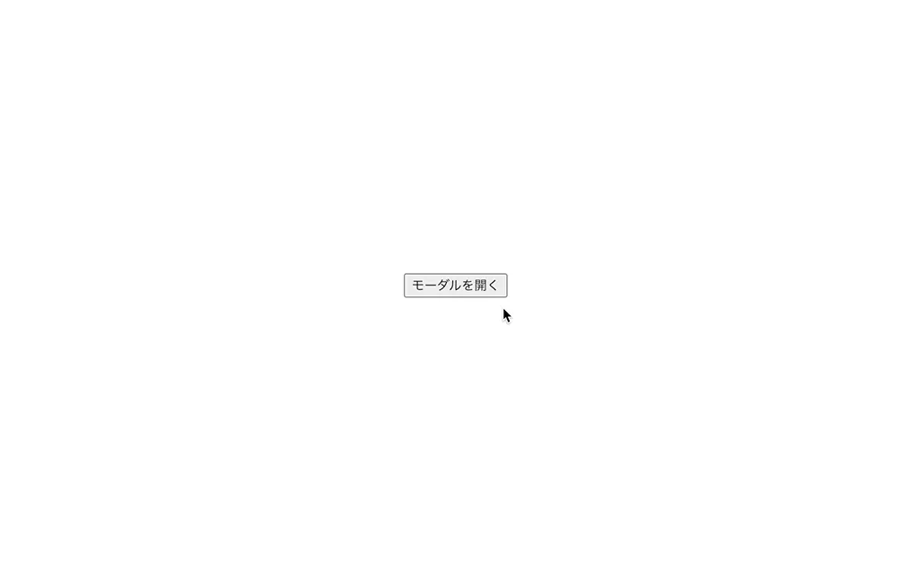
無事モーダルが表示され、
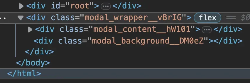
bodyタグ直下の最後尾にレンダリングされていた 🎉
5. テスト実装
<div className={styles.wrapper}><div className={styles.wrapper} data-testid="modal-wrapper">import Modal from "./modal";import { render, screen } from "@testing-library/react";import userEvent from "@testing-library/user-event";
const DUMMY_MODAL_TEXT = "ダミーのテキストです。";const DUMMY_BUTTON_TEXT = "ダミーのボタンです";
describe("Modalコンポーネント", () => { test("「開く」ボタンをクリックするとモーダルが開く", async () => { render( <Modal buttonText={DUMMY_BUTTON_TEXT}> <p>{DUMMY_MODAL_TEXT}</p> </Modal> ); userEvent.click(screen.getByText(DUMMY_BUTTON_TEXT));
expect(await screen.findByTestId("modal-wrapper")).toBeInTheDocument(); expect(await screen.findByText(DUMMY_MODAL_TEXT)).toBeInTheDocument(); });
test("xボタンをクリックするとモーダルが閉じる", async () => { render( <Modal buttonText={DUMMY_BUTTON_TEXT}> <p>{DUMMY_MODAL_TEXT}</p> </Modal> ); userEvent.click(screen.getByText(DUMMY_BUTTON_TEXT)); userEvent.click(await screen.findByText("×"));
expect(await screen.findByTestId("modal-wrapper")).not.toBeInTheDocument(); });});最低限のテストも実装し、無事通った。